Yelp wants to increase user engagement by appealing to travelers. How? By adding a feature to their app that allows users to create itineraries for their travels, as well as record their actual experiences.
*This was a group project at General Assembly delivered in 2 weeks.
My Role:
User Research - Survey and interview users
UX Design - strategize with the team on design priorities and user flows
Usability Testing - test iterations and iterate
Tools:
Whiteboard
Pen and paper
Google Forms
Sketch
Invision
Keynote
Research
The brand
We needed to learn a little more about Yelp.
According to Yelp’s website, these are a few metrics as of June ’15:
Yelp ranked #7 Top Visited Site
68% of searches on Yelp came from mobile devices across the globe
55+% of content on Yelp was created from mobile devices
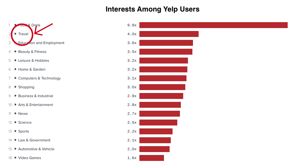
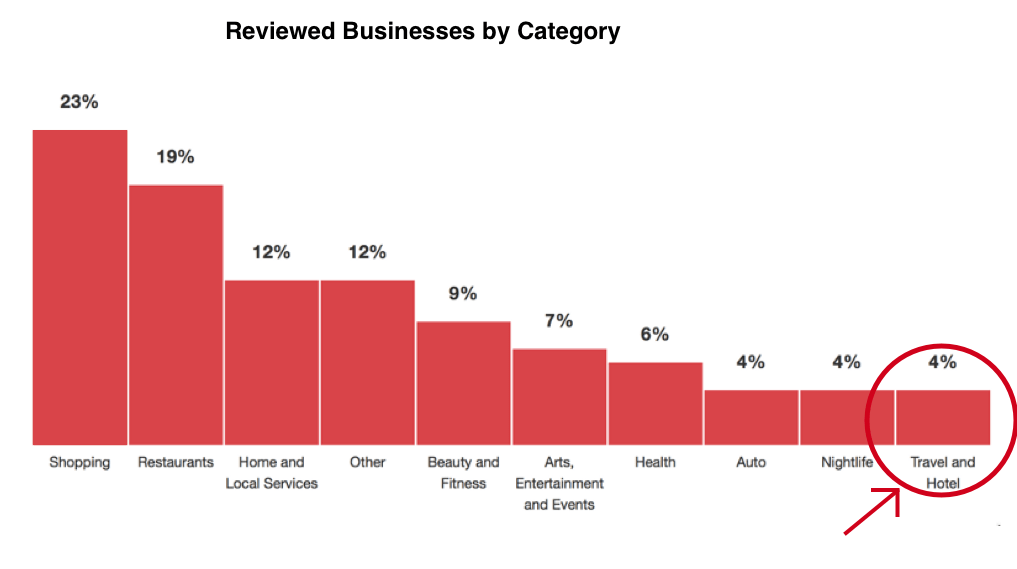
Interestingly, we found that the second highest interest among Yelp users at the time was travel; however, travel was the least reviewed catergory on Yelp. We couldn't help but realize this was a unique business opportunity.
User Research
Survey
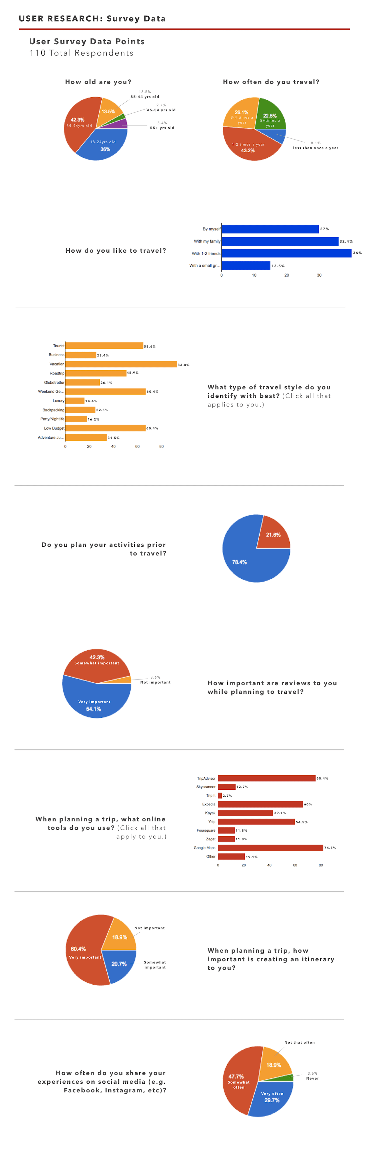
To better understand users’ general behavior in trip planning, we created a 10 question survey, and received 110 responses.
EARLY SURVEY FINDINGS
78.4% of users stated they plan their activities prior to travel.
54.1% listed reviews as "very important" when planning travel.
Users listed multiple different travel apps, 54.5% of which selected Yelp.
60.4% listed creating an itinerary as "very important" when planning a trip.
User Interviews
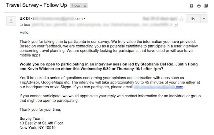
We recruited interview participants out of the list of survey respondents. As User Experience Designers, we made sure to consider the experience of our survey respondents in our request to interview by expressing gratitude for their participation and respectfully requesting their time for further research. This email was well received.
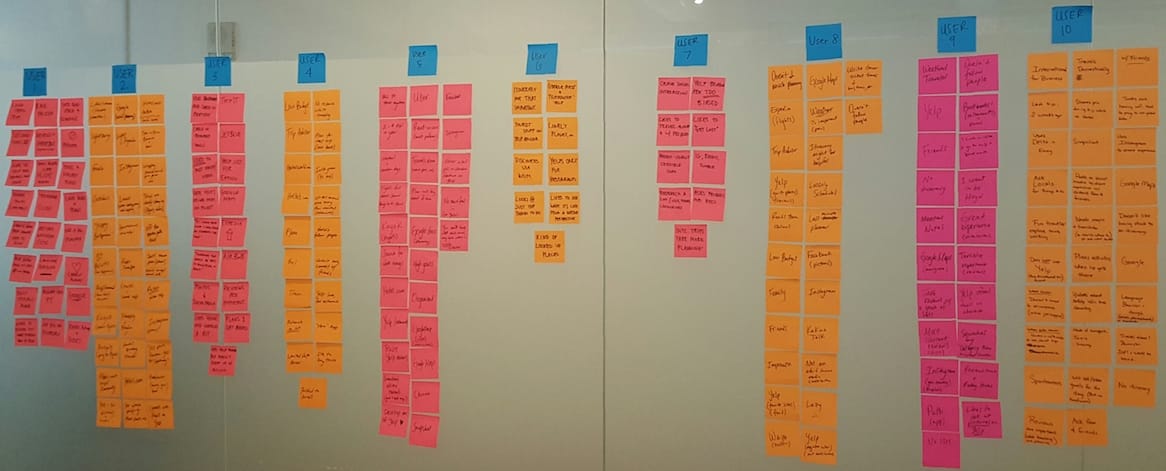
We conducted ten user interviews in which we were hoping to learn more about the context of their travel planning behavior, preferences, and any pain points they encounter.
Our team synthesized the qualitative findings using an affinity map in which we all had a view of each answer, were able to openly discuss findings and ultimately identify key user patterns.
Findings:
Users don’t make itineraries. They make lists.
Flexibility is preferred over set schedules.
There is no “go-to app” for travel. Users use MANY apps to serve a different aspect of the process.
Social elements are very important.
Yelp is most often used just to check reviews (rating, price, etc.)
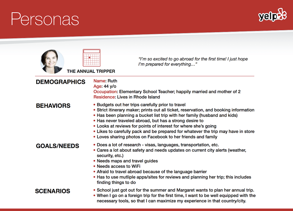
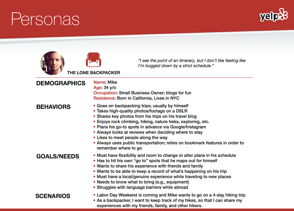
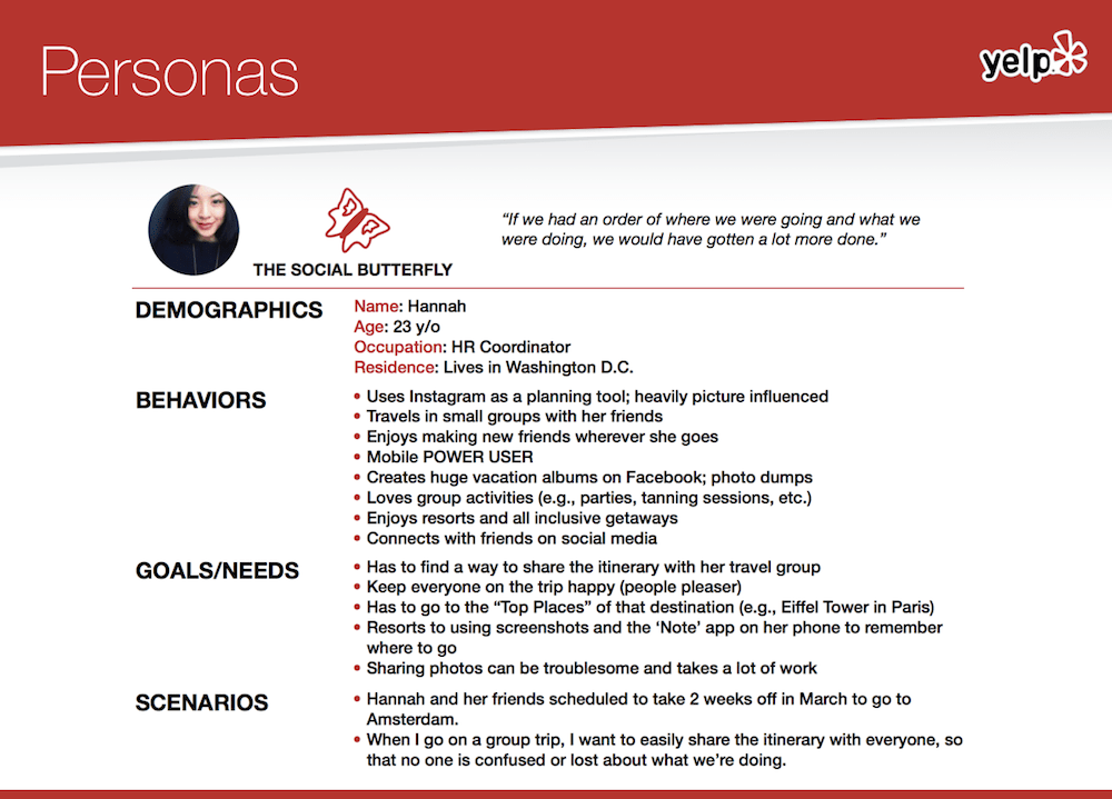
Personas
Personas are fictitious characters created from qualitative user data to represent users and to tell their story (background, demographic, tech usage, behaviors, pain points etc.) From our data, we created 3 personas to represent our users.
Competitive Analysis
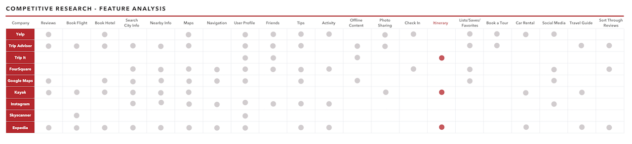
Because Yelp was stepping out of its core value proposition into travel, we let user interviews guide us in deciding who Yelp’s true competitors are in terms of adding a travel planning feature. We analyzed the below competitors and documented it in a feature analysis chart.
Feature analysis chart:
Findings:
Main features vary among competitors
One app is not enough
There is no one and only “go-to” traveler app
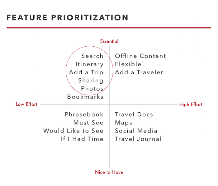
Feature Prioritization & Design
We needed to prioritize our features to make sure we provided the minimum viable solution for this problem. We had a short two weeks, so we couldn’t design every idea we had; but even if we did have the time, we shouldn’t design too many features. That could lead to the user feeling decision fatigue and ultimately hurt the user experience. So we mapped out our ideas from low effort v. high effort (x-axis) in relation to to what was essential v. nonessential (y-axis).
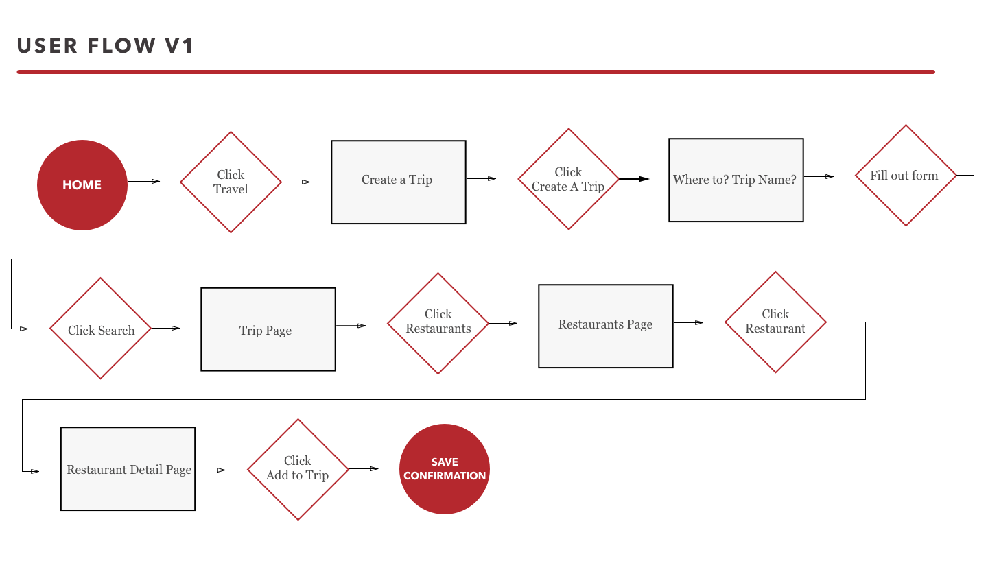
User flows
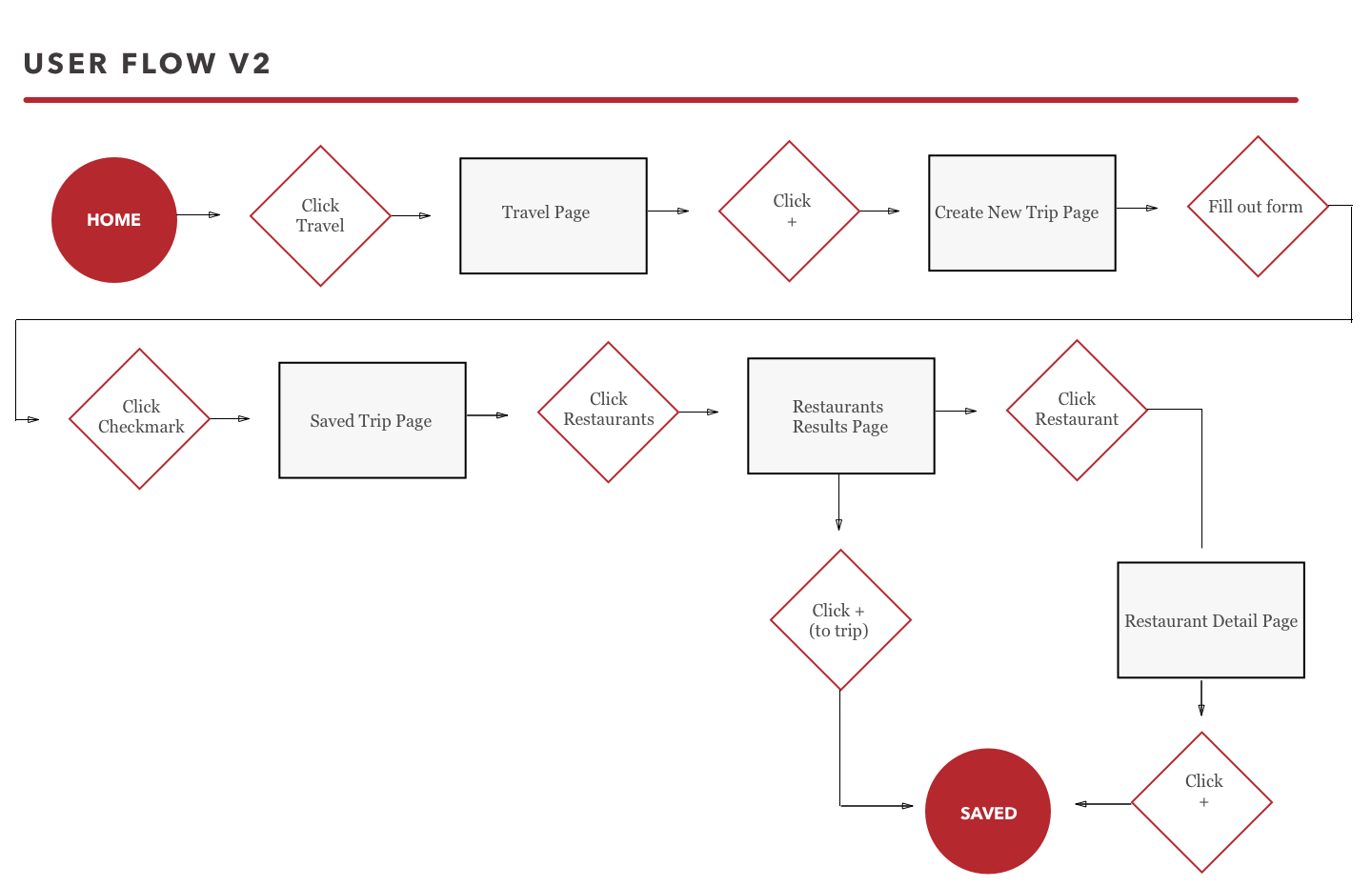
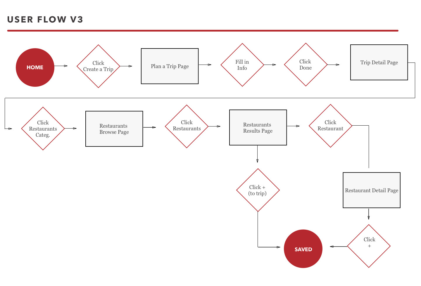
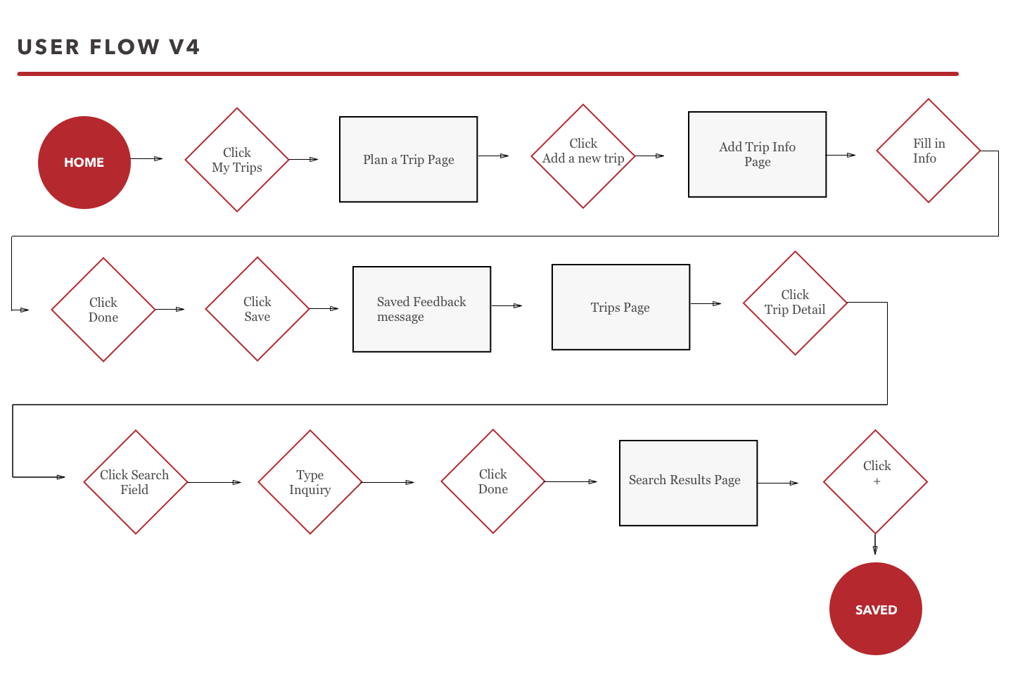
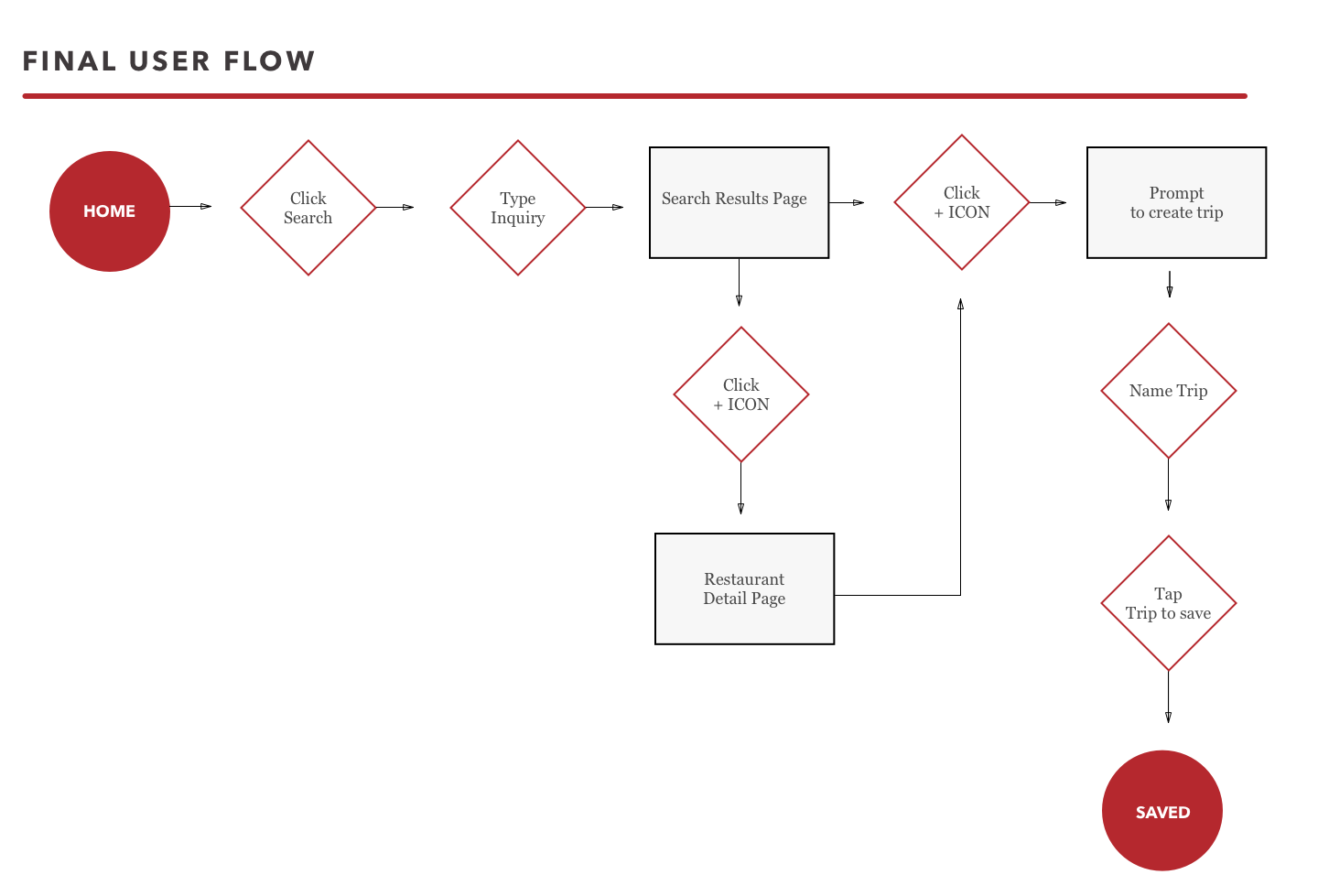
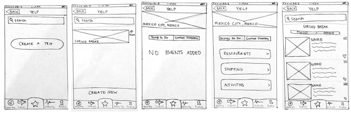
A user flow is a visual diagram of the user's intended path to complete the task to be designed. It consists of the number of clicks needed to complete the task as well as the pages landed on. The user flow served super helpful in ensuring we didn’t miss a screen in our design sprints. To save time, our user flows were done on a white board (not on sketch like the ones you see here), and iterated on as we tested. The four small ones are the iterations we went through as we gained user testing feedback.
Usability Testing + Iterations
UX is an iterative process from start to finish, and this project was no exception. We started off sketching by hand as a team to get our ideas down quickly. We’d then come together discuss the designs, and sketch again. We rapidly prototyped and tested our iterations and then we’d come together to discuss the pain points and findings. And back to sketching, wireframing, prototyping, testing. We must have gone through what felt like a million iterations, but I’ll only show you four. ;)
Iteration 1
The navigational word “Travel” was confusing to users.
Once in the travel section, the navigation didn’t indicate the user was in “Travel” which violates a usability heuristic that users should always know where they are.
No CTA button to create or add to itinerary. Oops.
No name of trip and the add to trip button not easily findable.
Iteration 2
“Travel” was changed to “Create a Trip”
The “Save” button in creating a trip was not visible.
Many simply started with “search” instead of “Create a trip”
User were left disoriented
Something indicating “Saved” trip was needed
Iteration 3
“Create a Trip” was changed to “My Trips;” however it was not immediately findable
“Save” button was still not visible
We attempted a “Search” within My Trips, but it was unsuccessful
No suggestions within “My Trip”
Tedious for some, seamless for others
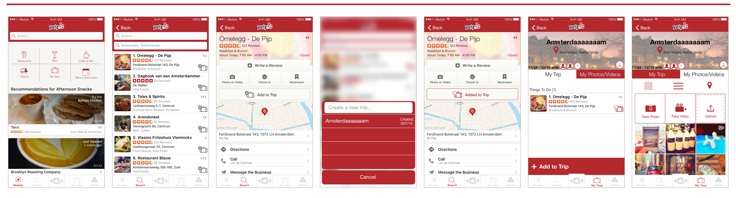
Final Iteration
User testing showed they started from “Search” rather than my trips. So we focused our final iteration on that specific user flow.
Learnings:
It was my first group project as a UX Designer, so I learned how to give & receive feedback, design collaboratively, delegate and share project deliverables.
We all learned the importance of Apple’s iOS Human Interface Guidelines, because a screen in our final iteration apparently violated HIG. Oy. It was a teaching moment for the entire class. #AwkwardPresentationFinale but a lesson learned nonetheless!
The importance of contextual inquiry. If you saw our user flows, you might have noticed there were MANY iterations. That’s because we didn’t know where to begin within Yelp’s ecosystem. However, if we had asked to see Yelp users actually USE Yelp in their normal context, we would have known from the start that most Yelp users start from “Search” and would have worked from there. Instead, we assumed the user would see our travel icon or microcopy which was ultimately proven wrong.